A lot of people try “quiet luxury” neutrals and end up looking… washed out. Or flat. Or like they accidentally dressed in the lighting section of a hardware store.
That’s not because neutrals are inherently dull. It’s because neutral outfits only look expensive when you control three things:
- Value (how light or dark each piece is)
- Temperature (warm vs cool undertones)
- Texture (how the fabric reflects light)
When you get those right, beige stops reading “basic” and starts reading “intentional.” Charcoal stops reading “office” and starts reading “sharp.” Cream stops reading “bridal” and starts reading “wealthy-but-not-trying.”
This guide is the color theory behind that effect, plus a practical framework you can actually use when you get dressed.
Quick answer for skimmers
- Luxury neutrals are built on value contrast, not just “matching colors.” Value is the lightness of a color, from black to white.
- Pick a side: warm neutrals or cool neutrals (most of the time). Mixing undertones is where outfits start to look off.
- Texture changes how a color looks. The same “beige” in matte wool vs shiny satin will read like different shades because texture changes reflected light.
- Monochrome doesn’t mean one color. It means one hue family with multiple values (light, mid, dark).
- Add one “anchor” piece (coat, trouser, bag, shoe) that sets the temperature and depth.
- Use simultaneous contrast on purpose. Colors shift depending on what’s next to them, including neutrals.
- If you want instant polish, control edges: shoe color, belt, and neckline are where “expensive” is won or lost.
If you only do one thing: choose two neutrals + one texture contrast (example: camel coat + cream knit + chocolate leather shoes). The texture contrast creates depth even if your palette is simple.
The decision framework: how luxury neutrals are built
Think of your outfit like a photo. Expensive-looking neutral outfits have clear “camera settings”:
1) Value (light vs dark) is the composition
In color theory, value means lightness. On the Munsell value scale, it runs from 0 (black) to 10 (white).
In outfits, value is what makes a look feel intentional, not mushy.
- Low value contrast (all similar lightness): elegant, soft, minimal
- High value contrast (light top, dark bottom): sharp, graphic, “editor”
2) Temperature (warm vs cool) is the harmony
Warm vs cool is relative, but the basic split is well understood: reds, oranges, yellows lean warm; blues and blue-greens lean cool.
Neutrals also have undertones, even if they look “plain.”
- Warm neutrals: cream, camel, warm beige, chocolate, warm taupe
- Cool neutrals: optic white, charcoal, slate, cool taupe, blue-black
3) Texture is the depth
This is the secret sauce. Texture changes perceived color because it changes how light hits the surface and reflects back to your eye.
That’s why tonal outfits look pricey when they mix cashmere, wool, silk, denim, leather, suede, or matte knits.
5 common mistakes (and fixes that actually work)
Mistake 1: “All neutrals go together”
They don’t. Not automatically. A warm oatmeal knit next to a cool greige trouser can look slightly sickly in daylight.
Fix: pick a temperature direction for the day:
- Warm day: cream + camel + chocolate
- Cool day: optic white + charcoal + slate
This won’t work if your closet is evenly split between warm and cool and you refuse to edit. You’ll either need two mini-palettes, or you’ll keep feeling like something is “off.”
Mistake 2: Matching hue, ignoring value
People buy “beige on beige” and wonder why it looks flat. Usually the values are too similar and the textures are too similar.
Fix: change one of these:
- make one piece lighter or darker, or
- swap one fabric finish (matte to sheen, smooth to fuzzy)
Mistake 3: Overusing black as the only “elevated” neutral
Black can look incredible, but head-to-toe black without texture often looks like “uniform,” not “luxury.”
Fix: if you wear black, add one texture change (matte wool trouser + leather shoe, or knit + satin, or denim + cashmere). Texture creates dimension.
Mistake 4: Adding too many “almost-neutrals”
Dusty rose, olive, stone, taupe, sand… they’re beautiful, but stacking too many muted tones can create a blurry outfit.
Fix: limit to two neutrals + one almost-neutral (max). Make the almost-neutral either clearly warmer or clearly cooler than the base.
Mistake 5: Thinking the brand name creates the “luxury look”
Not reliably. A pricey coat in the wrong temperature and value can still look odd.
Fix: build the color structure first, then upgrade pieces over time.
The deep dive: the actual color theory that makes neutrals look “rich”
1) Value is why tonal outfits look expensive
The Munsell system separates color into hue, value, and chroma. Value is literally the lightness scale.
In luxury styling, you’ll see this pattern constantly:
- Light base + mid layer + dark anchor
Example: cream tee + oat sweater + espresso coat
That dark anchor is the frame. It gives your neutrals an edge.
Quick self-check: take a mirror photo and turn it black-and-white.
If everything collapses into one gray blob, you need more value separation.
2) Temperature is why “cream” can look wrong on you
Warm vs cool isn’t just about your skin. It’s about the whole outfit.
A warm cream beside a cool charcoal often reads dirty or mismatched because the undertones fight. Warm/cool theory is relative, but the principle is consistent.
If you want a cheat:
- Pair warm neutrals with warm metals (gold tones) and warm browns
- Pair cool neutrals with cool metals (silver tones), black, and blue-grays
3) Simultaneous contrast is why neutrals shift in real life
Simultaneous contrast means adjacent colors change how you perceive each other, even if the colors themselves do not change.
In outfits, this shows up like:
- A cream shirt looks brighter next to charcoal than next to camel.
- A taupe coat can look greener next to olive, or pinker next to cool gray.
That’s why “this looked fine at home” happens. Your bathroom lighting and wall color are changing perception, too.
4) Texture is the real reason luxury neutrals feel layered
Texture changes the angle and amount of reflected light, which changes color appearance.
Smooth, shiny fabrics read brighter and sharper; matte fabrics read softer and deeper.
So if you want a neutral outfit to look intentional, you do not need more colors. You need more surfaces.
A simple example:
- Matte wool trouser (absorbs light)
- Smooth leather belt (reflects light differently)
- Soft knit (scatters light)
Same “color family,” totally different depth.
The 7-step method to build neutral outfits that look expensive
If you already have a routine that works, you can skip this section and go straight to the variations below.
Step 1: Pick your anchor neutral
Choose one: black, charcoal, navy, chocolate, camel, or cream.
Anchor neutral = the piece that sets your temperature and depth (coat, blazer, trouser, boot).
Step 2: Choose your temperature lane
- Warm lane: cream, camel, warm taupe, cocoa
- Cool lane: optic white, charcoal, slate, blue-black
Try not to straddle lanes in the same outfit until you know what you’re doing.
Step 3: Decide your value contrast
Pick one:
- Low contrast: tonal, calm, soft (great for daytime, minimal vibe)
- Medium contrast: easiest to wear, looks polished
- High contrast: bold, sharp, more “fashion”
Step 4: Add one texture contrast
This is the “expensive switch.”
Examples:
- wool + leather
- cashmere + denim
- matte cotton + satin
- suede + crisp poplin
This is optional. Skip it if your day is chaotic and you just need to get dressed. Value contrast alone can still carry you.
Step 5: Control the edges
Edges = shoes, belt, bag, neckline, cuffs.
Neutral outfits look cheap when the edges look random.
- If your outfit is warm, keep the edges warm (tan, chocolate, warm metal).
- If cool, keep edges cool (black, gray, silver-toned hardware).
Step 6: Keep accents small and intentional
A single accent works best: scarf, lipstick, nail, bag, sunglasses.
Neutrals already create a calm base. Over-accenting breaks the luxury illusion.
Step 7: Use the black-and-white camera check
This is your easiest quality control:
- If you see shape and structure in grayscale, your outfit has value design.
- If it disappears, adjust values or add texture.
Variations: neutral outfits by lifestyle and vibe
1) The “quiet luxury” uniform (low contrast)
- Cream knit + oat trousers + tan loafers
Why it works: same temperature, close values, texture carries it.
Trade-off (no solution): low contrast can photograph flat in bad lighting. That’s just the nature of it.
2) The “sharp minimal” look (high contrast)
- Optic white shirt + charcoal trouser + black shoe
Why it works: strong value structure, clean edges.
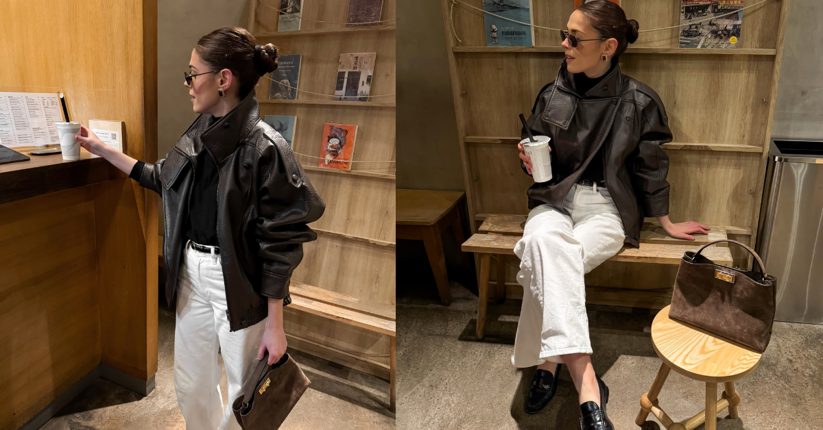
3) The “rich warm neutral” look
- Camel coat + cream top + chocolate boot
Why it works: warm lane, clear anchor, depth at the bottom.
You’ll see this warm-neutral direction supported in broader color trend coverage too, like Pantone discussing evolved neutrals that lean warmer.
4) The “cool monochrome” look
- Slate sweater + charcoal jeans + black belt
Why it works: cool lane, staggered values, grounded edges.
5) The “textural luxe” look (best for basics-heavy closets)
- Gray tee + gray wool trousers + suede jacket
Why it works: nearly monochrome, but textures create separation.
6) The “soft neutral with one statement” look
- All neutrals + one bold shoe or bag
Example: cream and camel outfit with a deep red bag
Why it works: neutrals act like a gallery wall.
FAQ
Why do neutral outfits sometimes look “cheap” even when the pieces are nice?
Usually one of these:
- values are too close (no structure)
- temperatures fight (warm + cool undertones mixed randomly)
- textures are too uniform (everything matte cotton)
Texture-driven perception shifts are real, not imagined.
How do I know if a neutral is warm or cool?
Compare it to a true white and a true gray in daylight.
- If it looks slightly yellow, red, or brown: warmer
- If it looks slightly blue, green, or purple: cooler
Warm/cool is relative, which is why side-by-side comparison helps.
Is monochrome always flattering?
Not always. Monochrome is a style choice, not a universal fix. If your outfit has very low value contrast and your own coloring has higher contrast, you might feel a bit “muted.” (Some people love that effect, some don’t.)
Why does my beige look different indoors vs outdoors?
Lighting and surrounding colors shift perception. That’s the same idea behind simultaneous contrast, where context changes how you see a color.
Do I need to follow seasonal color analysis for this to work?
No. Seasonal palettes can help, but luxury neutral styling is mostly value + temperature + texture, which you can learn without typing yourself into a category.
What’s the simplest neutral palette to start with?
Pick one lane:
- Warm starter set: cream, camel, chocolate
- Cool starter set: optic white, charcoal, black
Then add texture variation.
Just a little note - some of the links on here may be affiliate links, which means I might earn a small commission if you decide to shop through them (at no extra cost to you!). I only post content which I'm truly enthusiastic about and would suggest to others.
And as you know, I seriously love seeing your takes on the looks and ideas on here - that means the world to me! If you recreate something, please share it here in the comments or feel free to send me a pic. I'm always excited to meet y'all! ✨🤍
Xoxo Dana